Google Analytics dashboard
draft · 2 image slots
The Google Analytics dashboard turns one company's website activity into a traffic and engagement report. By the end, you will know which cards answer reach, acquisition, behavior, and page-level questions.
Set the scope first
Open Dashboards → Google Analytics, choose the company, and set the reporting period. Turn on a comparison when you want the headline cards to show the earlier value and the change between the two periods.
Read the headline and funnel
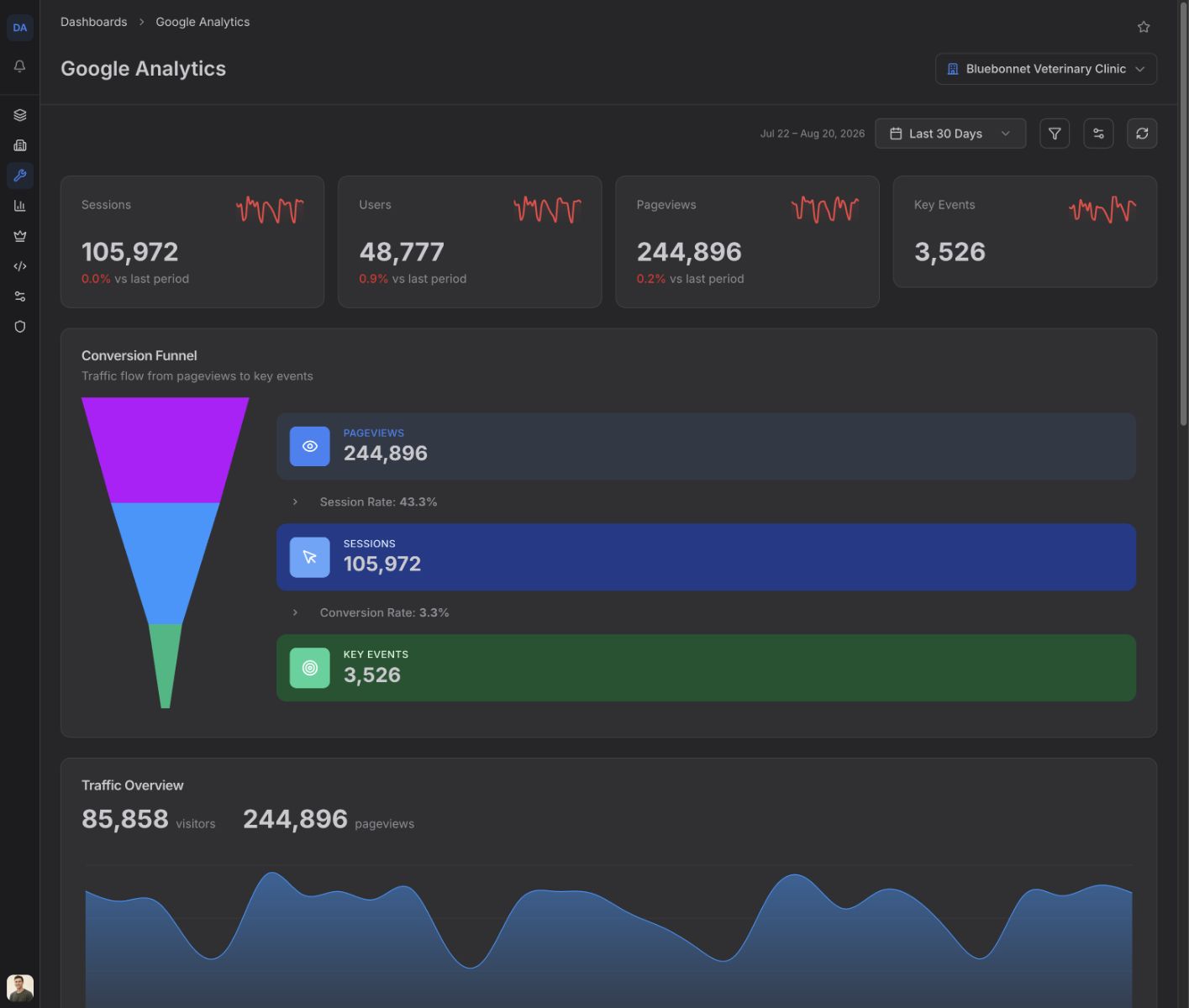
The first four cards are Sessions, Users, Pageviews, and Key Events. Together they tell you how many visits happened, how many users Google Analytics counted, how much content was viewed, and how many configured key events fired.
Conversion Funnel puts Pageviews, Sessions, and Key Events in sequence. Its Session Rate is sessions divided by pageviews. Its Conversion Rate is key events divided by sessions. These are event ratios, so use them to compare periods rather than as a count of people who followed one exact path.
Find what changed over time
Traffic Overview plots visitors and pageviews by date. Use it to find spikes, drops, and sustained changes that a period total can hide. Its visitor total adds the daily visitor counts, so it can be higher than the Users card, which counts users across the full selected period.
Sessions & Engagement compares sessions with Engaged Sessions. The total and percentage below the chart show how many sessions Google Analytics classified as engaged relative to all sessions.
Key Events ranks the five most frequent key-event types and shows each one's count and share of the displayed events.
Find where traffic and users came from
Traffic Sources groups users by the exact source and medium reported by Google Analytics. It shows the eight largest groups and each group's share of users across those displayed groups.
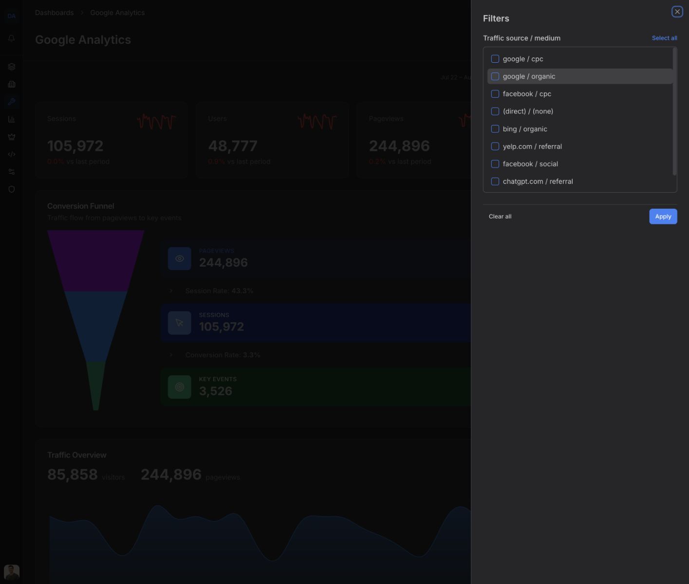
Choose Filter, then use Traffic source / medium to narrow the dashboard data to selected source-and-medium pairs. Choose Apply to close the sheet. Clear all returns to the unfiltered result.
Devices shows the user count and share for each device category. Top Cities lists users and sessions by city. Top Pages ranks pages by pageviews and also shows users, which separates high-volume content from pages reached by a broader audience.
Adjust the layout
Choose Customize Dashboard to show, hide, or reorder widgets for the selected company. If the page says All widgets are hidden, use the same control to turn at least one back on.